Getting Started
Creating an Account
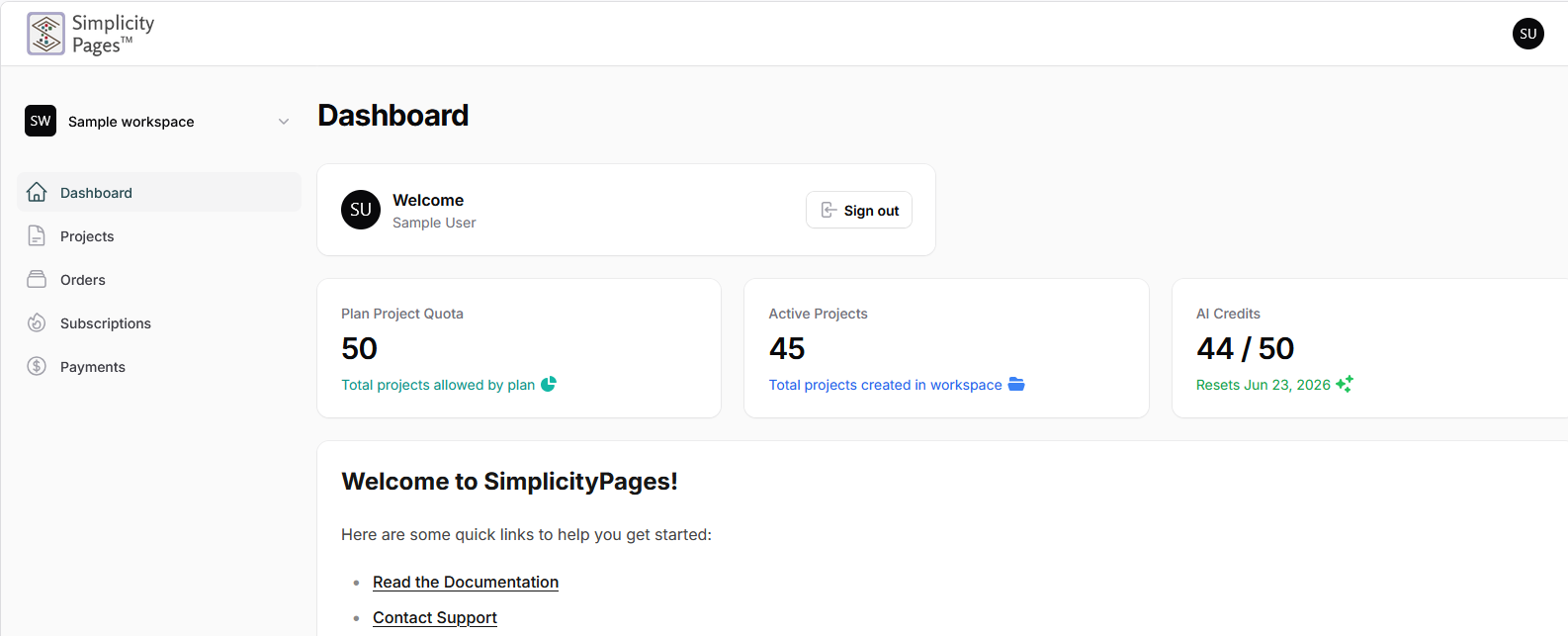
Visit the SimplicityPages website and click Get Started or Sign Up. Fill in your name, email address, and a password (minimum 8 characters), then click Create Account. You will be logged in immediately and taken to your dashboard.
Your account comes with a monthly AI credit allowance that resets on the same day each month based on your signup date.
The Dashboard
The dashboard is your home base. From here you can:
- See all your projects and their publish status
- Check your current AI credit balance
- Create new projects
- Open, edit, or delete existing projects
- Manage your subscription
Creating a New Project
Click New Project from the dashboard. You will be prompted to choose how you want to build your page — AI Generated or Builder.
AI Generated
Choose AI Generated to let the AI build your page for you. This launches the six-step AI Wizard where you describe your business, choose a visual style and color scheme, select the sections you want, and the AI generates a complete page from your input.
This is the fastest way to get a professional-looking page. The AI handles layout, copywriting, and design. You can refine the result afterward using the inline editor.
See the AI Wizard section for a full step-by-step walkthrough.
Builder
Choose Builder to build your page manually using the full drag-and-drop editor. You will first be asked to pick a starting template as your foundation, then you are taken directly into the builder where you have complete control over the layout, content, and design.
The Builder is ideal if you want full creative control, have a specific design in mind, or want to create something beyond what the AI wizard produces.
The AI Wizard
The AI Wizard guides you through six steps to generate a complete landing page. Your progress is saved automatically at each step, so you can navigate back and forth without losing your work.
Step 1 — About Your Business
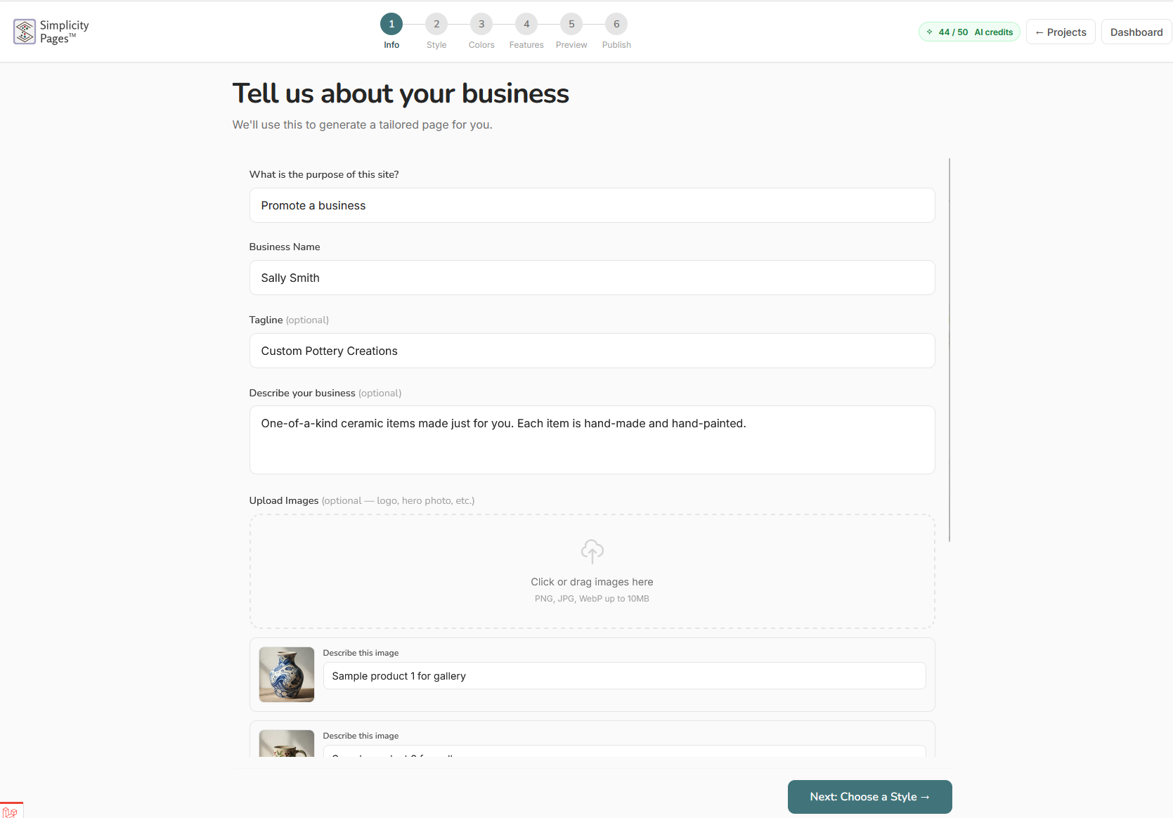
Tell the AI what your business does. Fill in:
- Business name
- What you do — a brief description of your product or service
- Target audience — who your customers are
- Call to action — what you want visitors to do (e.g., "Book a free consultation", "Shop now", "Get in touch")
Be specific. The more detail you give, the better the AI understands your brand. You can include key selling points, tone preferences, or specific content you want on the page.
Click Next when ready.
Step 2 — Choose a Style
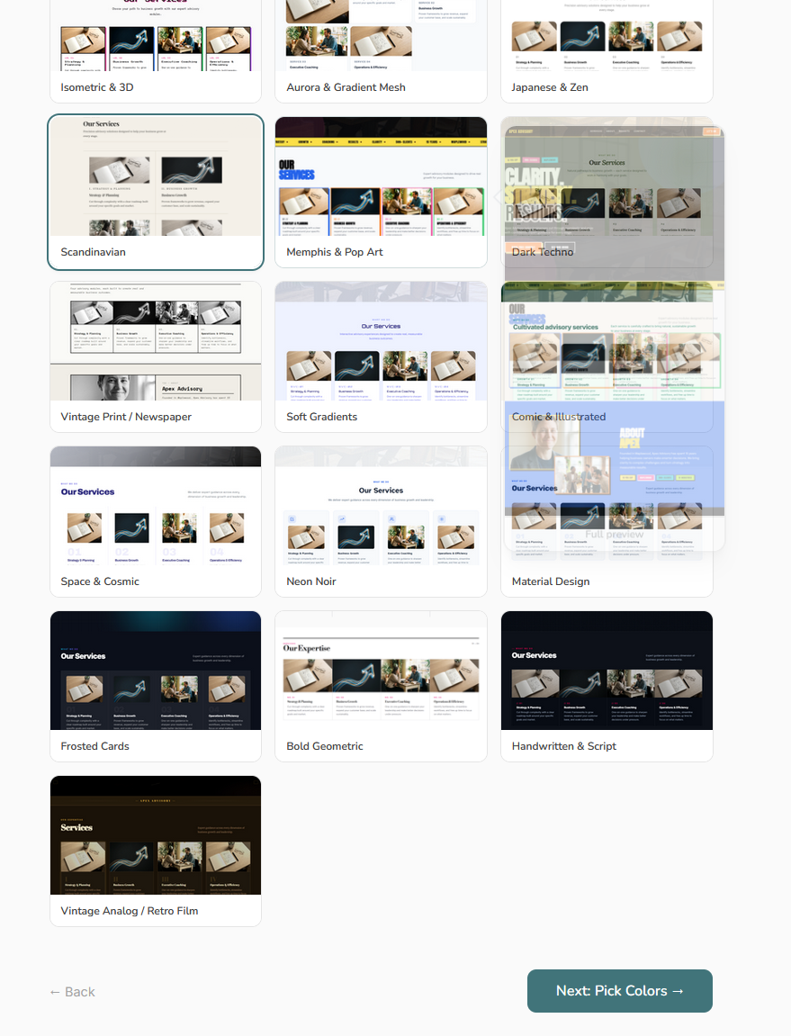
Browse the template gallery and pick a visual style that fits your brand. Hover over any thumbnail to see a full preview of the layout beside it. Click a style to select it.
The style determines the layout, typography, and overall aesthetic. The AI applies your content and color choices on top of this foundation.
Click Next: Pick Colors to continue.
Step 3 — Choose Colors
Pick a color scheme for your page.
Preset Palettes
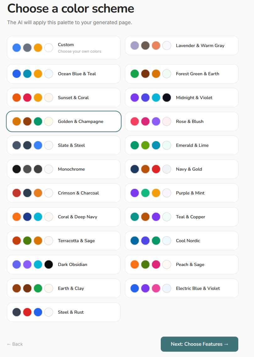
Choose from a curated set of color combinations. Click any palette card to select it.
Custom Colors
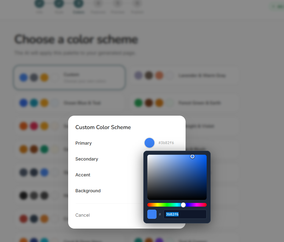
Click the Custom card to define your own colors. A dialog opens where you set four values:
- Primary — your main brand color, used for headings and key elements
- Secondary — a supporting color for subtler accents
- Accent — a highlight color for buttons and calls to action
- Background — the page background color
Click any color swatch to open the color picker. Use the gradient square to adjust saturation and brightness, drag the hue slider for a different color family, or type a hex code directly. Click Apply to confirm, or Cancel to revert all colors to what they were before you opened the dialog.
Click Next: Choose Features when done.
Step 4 — Choose Features
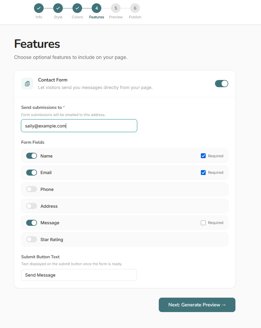
Select which sections to include on your page — options typically include a hero banner, features or benefits list, testimonials, FAQ, contact information, and more. Toggle the sections you want.
If you already have a generated page and want to keep it, use the Skip link to jump ahead to the preview step without regenerating.
Click Next to proceed to generation.
Step 5 — Preview & Edit
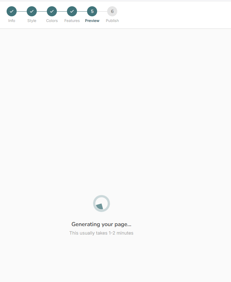
The AI generates your page based on everything you provided. This step uses one AI credit. A spinner is shown while the page is being built — this typically takes 20–60 seconds.
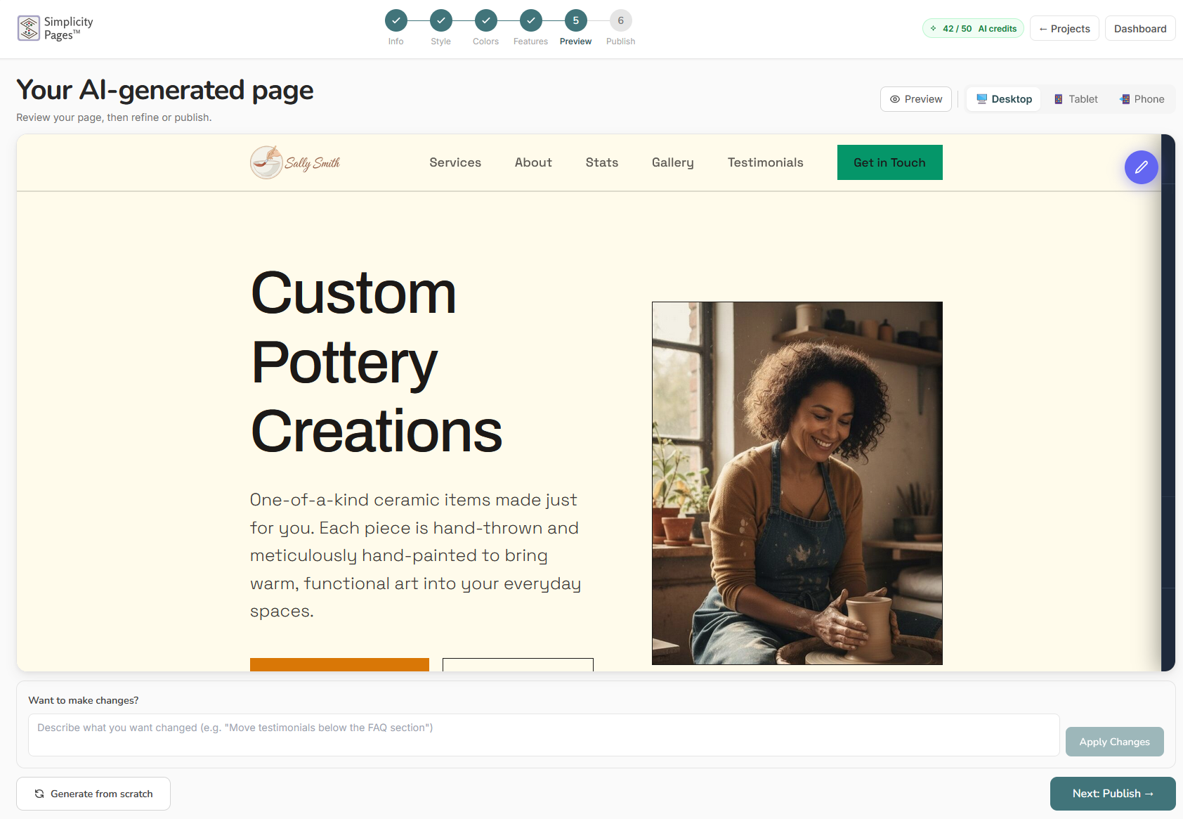
Once generated, you will see a live preview. From here you can:
- Regenerate — click Generate New Version to have the AI try again. You can add refinement instructions before regenerating (e.g., "make the tone more formal", "add more detail to the features section"). Each regeneration uses one credit.
- Edit inline — click directly on text, images, or colors in the preview to make changes without re-running the AI.
Editing Text
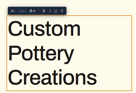
Click on any text in the preview to edit it directly. A cursor appears and you can type your changes. Click outside when done.
Editing Colors
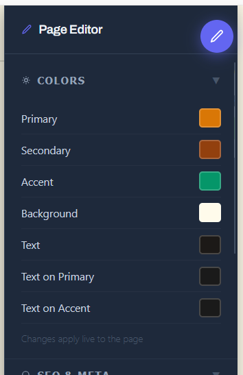
Click the color swatch on any element to open the color editor and change its color immediately.
Swapping Images
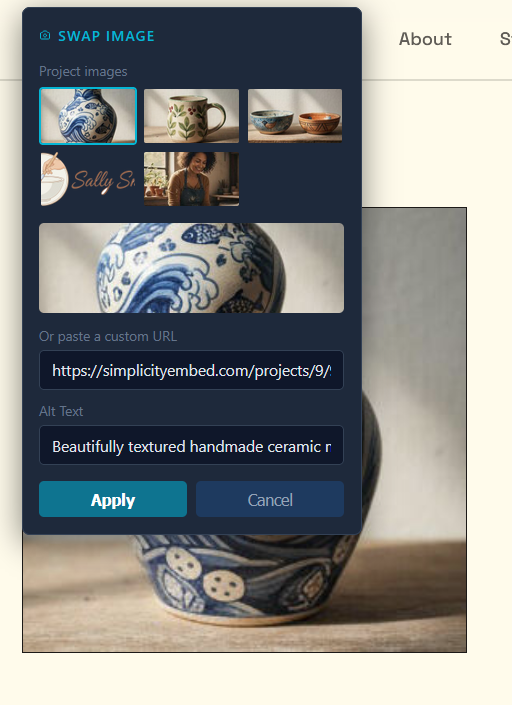
Click any image in the preview to replace it with a different image URL.
Block Controls
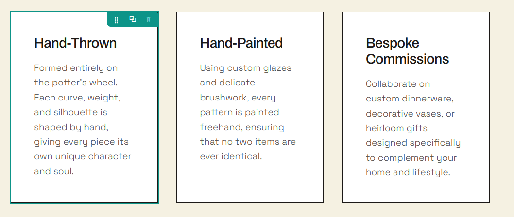
Hover over a section to reveal controls for dragging it to a new position, duplicating it, or deleting it.
Page Settings
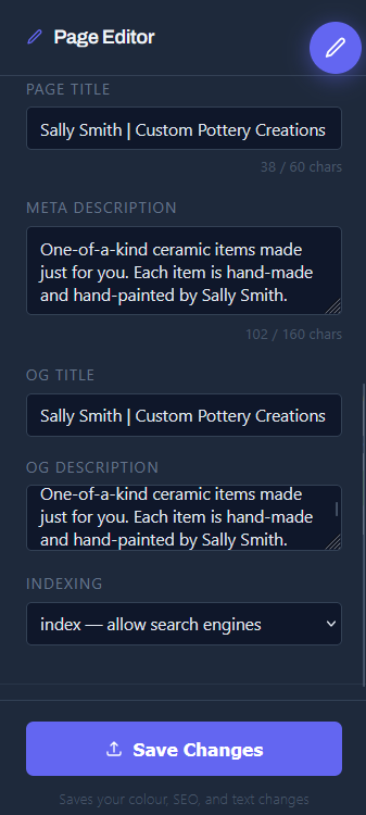
Use the page settings panel to adjust global settings such as fonts, max page width, and overall spacing.
When you are satisfied with the result, click Next: Publish.
Step 6 — Publish
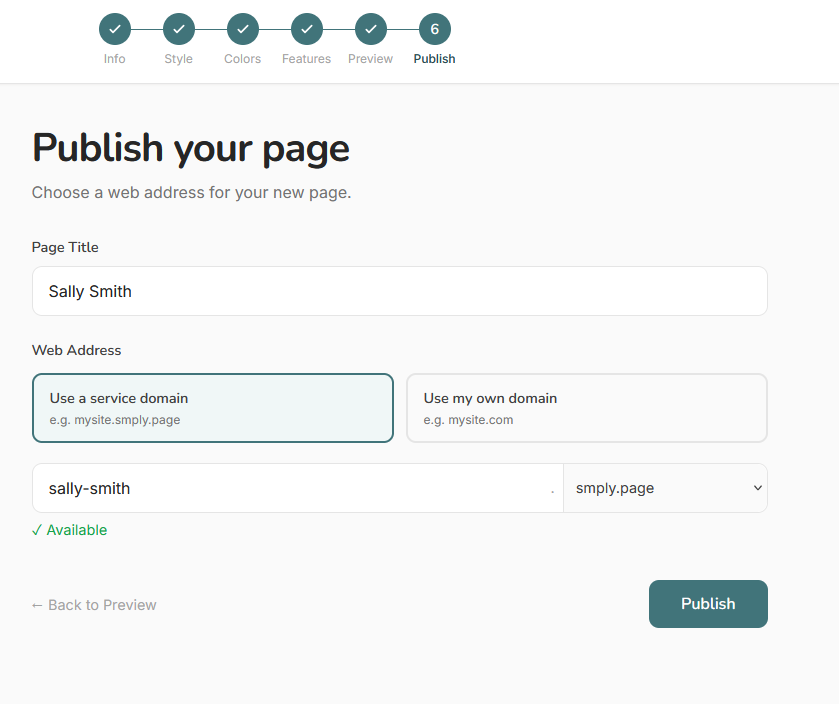
Make your page live. You have two publishing options:
In-house Subdomain
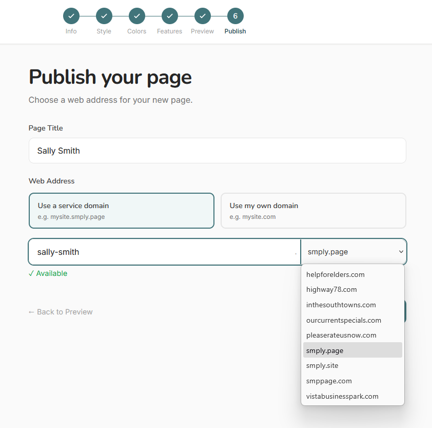
Choose from the available domains (e.g., yourbrand.smply.page) and enter a subdomain name. Your page is immediately live at that URL.
Custom Domain
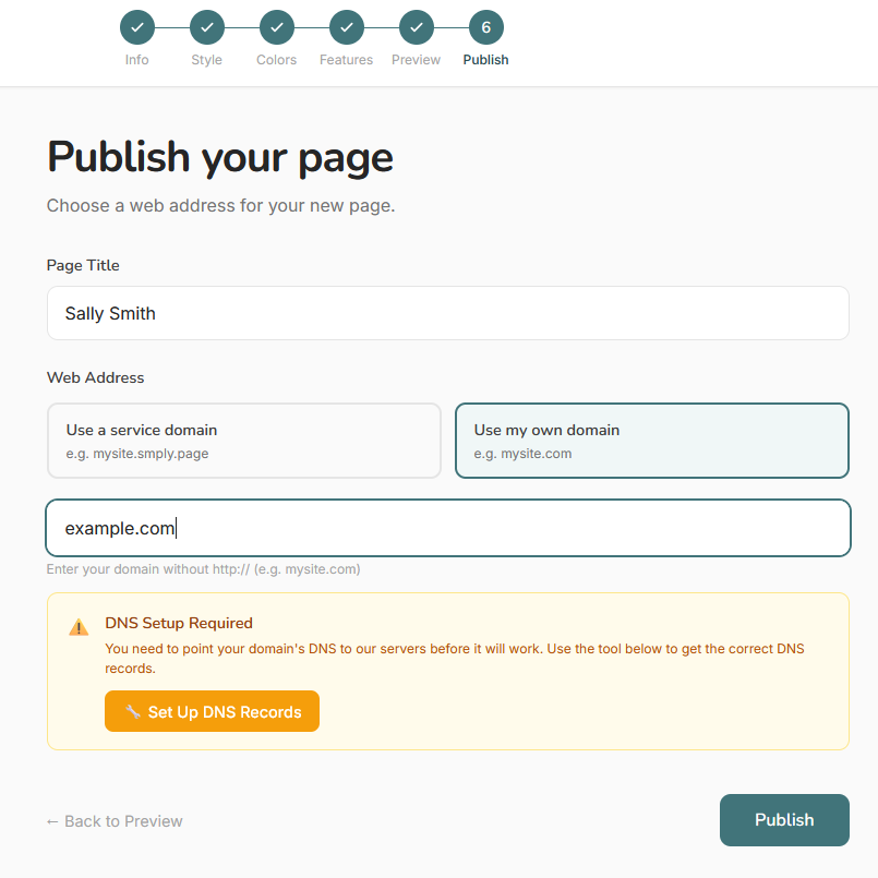
Use your own domain name (e.g., www.yourbusiness.com). Enter your domain, then follow the DNS instructions shown — create an A record pointing to the IP address provided. Once DNS propagates, click Verify. Your page goes live automatically once verified.
Managing Projects
All your projects are listed on the dashboard. From there you can open, edit, or delete any project.
Editing a Project
From the dashboard, find the project in the list and click Edit. This opens the page in the inline editor where you can update text, images, and colors directly in the preview.
For AI-generated projects, you can also re-run the AI wizard to regenerate the page from scratch with different style or color choices. Open the project options menu and choose Re-run Wizard.
Deleting a Project
From the dashboard, open the options menu for the project and select Delete. You will be asked to confirm. Deletion is permanent — the page, all saved HTML, and any uploaded images for that project are removed.
If the project was published, the URL stops working immediately after deletion.
AI Credits
Generating or regenerating a page with the AI wizard uses one credit per generation. Your monthly credit allowance resets on the anniversary of your signup date each month.
Your current balance is shown in the wizard header while working on a project, and on the dashboard. If you run out of credits, you will need to wait for the monthly reset or upgrade your plan before generating new pages.
Account & Billing
Manage your subscription and billing details from the dashboard.
Managing Your Subscription
From the dashboard, click Subscription in the left navigation. Here you can see your current plan, billing interval, next renewal date, and payment details. You can also change your plan or update your payment method from this page.
Cancelling Your Subscription
To cancel, go to Dashboard → Subscription in the left navigation, then click Cancel Subscription.
You will be taken to a confirmation page. To proceed, click No, proceed with cancellation.
Your access continues until the end of your current billing period. After that, your account reverts to a free tier or is deactivated depending on your plan.
Tips for Best Results
- Be specific in Step 1. Vague descriptions produce generic pages. Include your actual business name, what makes you different, and the exact action you want visitors to take.
- Try different styles. A style can look completely different once your real content is applied. Regenerate with the same content but a different style to compare.
- Use refinement instructions. Instead of regenerating blind, add a note such as "the headline feels too casual — make it more professional" before clicking regenerate. The AI builds on your feedback each time.
- Edit after generation. The AI gets you most of the way there. Use the inline editor to polish the final details — adjust wording, tweak colors, or swap images.
- Save credits by editing, not regenerating. Small changes like wording or color adjustments are free in the editor. Reserve regenerations for when you want substantially different content or layout.
- Custom domains take time. DNS changes can take a few minutes to 48 hours. If verification fails, wait 30 minutes and try again before contacting support.
Builder Interface
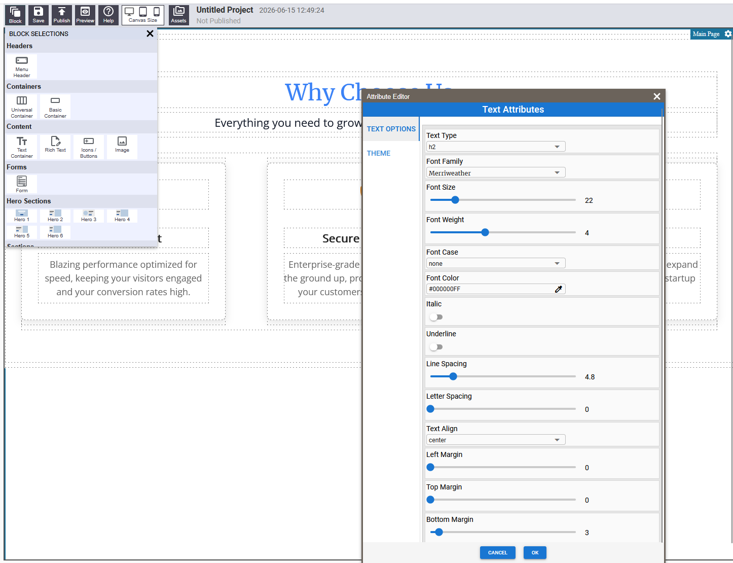
The builder is made up of three main areas: the toolbar across the top, the block panel on the left, and the page canvas in the center. When a block is selected, a settings panel opens on the right.
The Toolbar

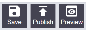
| Button | What It Does |
|---|---|
| Blocks | Opens the block panel so you can drag new content onto your page |
| Save | Saves your current work |
| Publish | Makes your page visible to visitors |
| Preview | Opens a clean preview of your page as visitors see it |
| Canvas | Changes the canvas width to check different screen sizes |
| Help | Opens help information |
The Block Panel
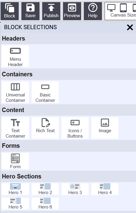
Click the Blocks button in the toolbar to open the block panel on the left. Blocks are organized into categories. To add a block, click and hold on a thumbnail, drag it onto the canvas, and release it where you want it.
The Page Canvas

The canvas is the main editing area. When you move your mouse over a block, a blue outline appears around it and a label shows the block's name.
The Settings Panel
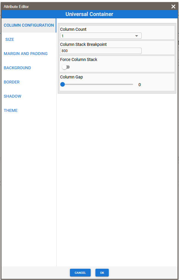
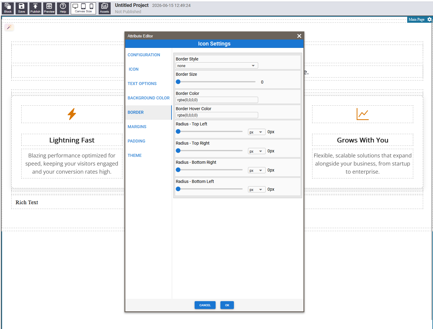
When you click the settings icon on a block, a panel slides open on the right. This is where you change colors, fonts, sizes, borders, spacing, and other visual properties. Changes are reflected on the canvas in real time.
Building Your First Page
Step 1 — Open the Block Panel
Click the Blocks button in the toolbar. The block panel opens on the left showing all available blocks organized by category.
Step 2 — Drag a Block onto the Canvas
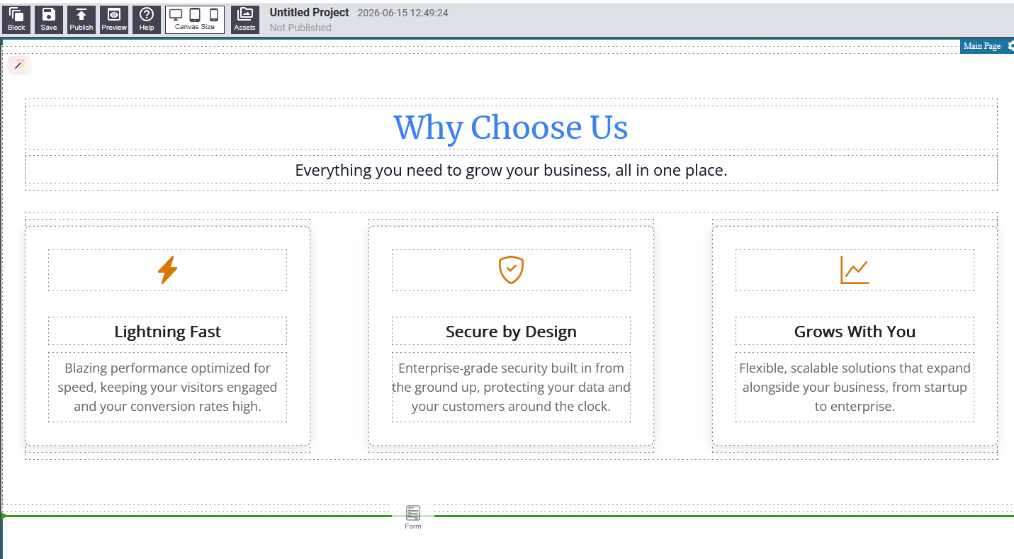
Click and hold on any block in the panel, then drag it over the canvas. A blue line appears showing exactly where the block will land. Release to drop it.
Step 3 — Edit the Block
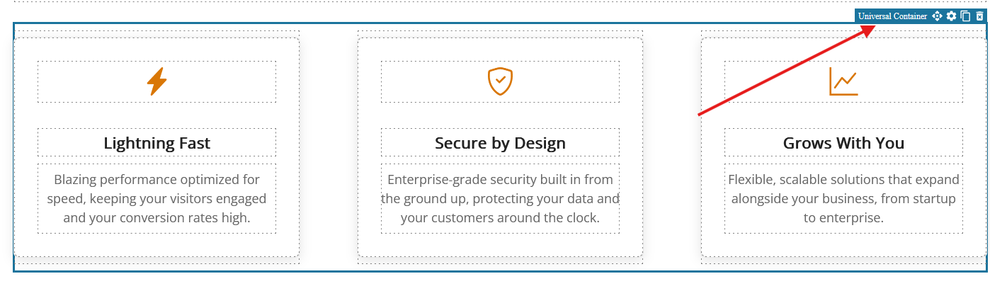
Hover over a block on the canvas to reveal the control bar:
- Settings (gear icon) — opens the settings panel for that block
- Duplicate — creates a copy of the block immediately below
- Delete (trash icon) — removes the block from the page
- Drag handle — grab to reorder the block by dragging it to a new position
For text blocks, you can also click directly on the text to start typing.
Step 4 — Rearrange Blocks
Hover over a block and grab the drag handle in the control bar. Drag the block up or down to a new position. The blue line shows where it will land.
Step 5 — Save Your Work
Click the Save button in the toolbar. Save frequently — whenever you are happy with a chunk of work, not just at the end.
Working with Text
Several block types let you edit text directly on the canvas by clicking on it. There are three ways text editing works:
Click-to-edit
For simple headings and short labels, click directly on the text and start typing. Click somewhere else when done.
Rich Text Editor
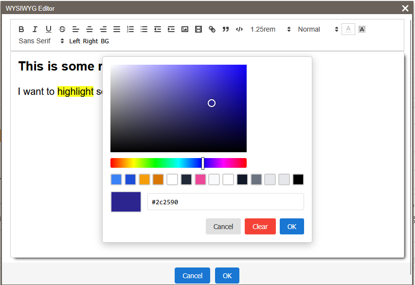
For body copy and longer content, clicking the text opens a small formatting toolbar above it. This works like a basic word processor:
- Bold and Italic
- Headings (H1 through H6)
- Bullet lists and numbered lists
- Links — highlight text and click the link button to add a URL
- Text alignment — left, center, right
- Undo / Redo
Settings Panel Text
Some blocks (like the Menu Header) have their text controlled through the settings panel rather than by clicking on the canvas. Open the settings panel (gear icon) and look for a text field in the relevant group.
Editing Appearance
To change the visual style of any block — colors, size, border, spacing — hover over the block and click the Settings icon. Common settings groups include:
- Background — solid color, gradient, or pattern
- Border — style, thickness, color, and corner radius
- Shadow — drop shadow position, blur, and color
- Size — width and height
- Spacing — margins (outside the block) and padding (inside)
Block Reference
SimplicityBuilder includes a set of content blocks covering the most common page elements. Use the menu on the left to browse each block and its available settings.
Menu Header

The navigation bar at the top of your page. Displays your logo and navigation links. On small screens the links collapse into a mobile menu.
Settings
Navigation
- Menu items — text labels for each link (one per line)
- Menu links — the URL or anchor each item links to (one per line, matching order)
- Mobile breakpoint — screen width at which the menu collapses
Size
- Height (desktop) and Height (mobile)
- Sticky — keeps the header fixed at the top as visitors scroll
Logo
- Logo image — upload or link to your logo
Colors
- Header background color and hover color
- Menu item text color and hover color
- Mobile menu background color
Universal Container
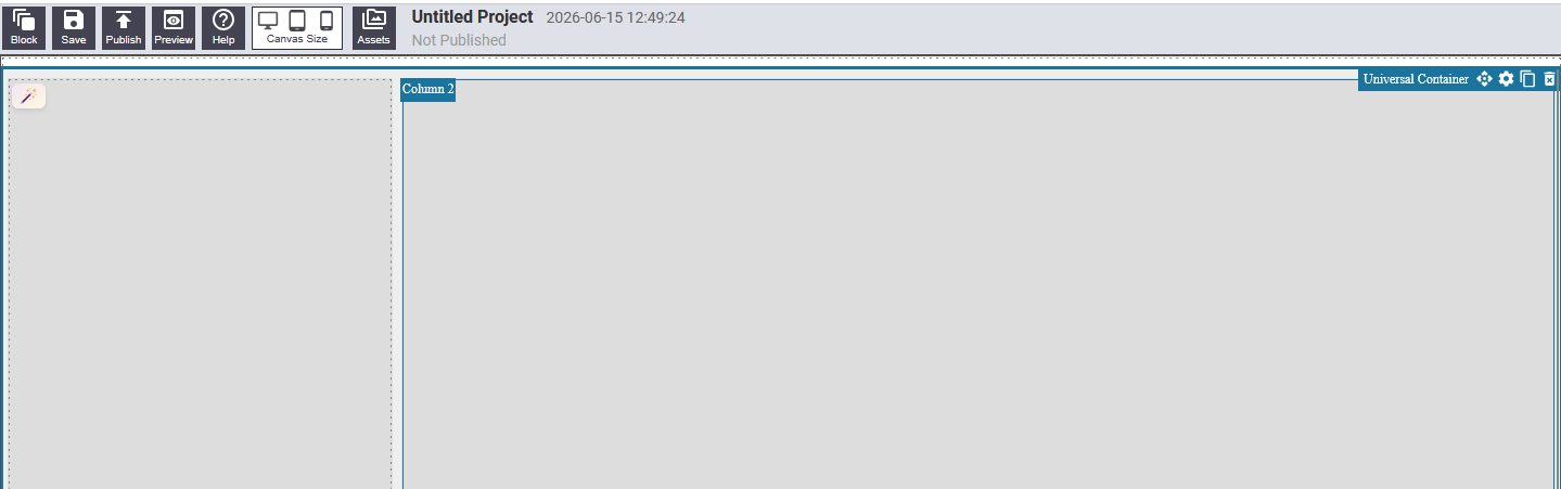
The most versatile layout block. A section of your page divided into one, two, or three columns. Place other content blocks inside each column to build side-by-side layouts, feature grids, and more.
Settings
Configuration
- Number of columns (1, 2, or 3)
- Column gap
- Force stack on mobile — columns stack vertically on small screens
- Mobile breakpoint
Size & Spacing
- Width, Height, Vertical margin, Vertical and horizontal padding
Background
- Solid color, two-color gradient, background image, decorative pattern overlay
Column Settings
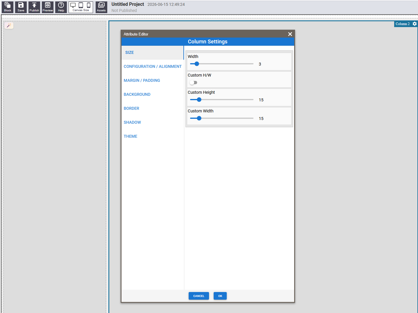
Click on a column to configure it individually: width fraction, stack order on mobile, vertical and horizontal alignment, per-column padding, background, border, and shadow.
Basic Container
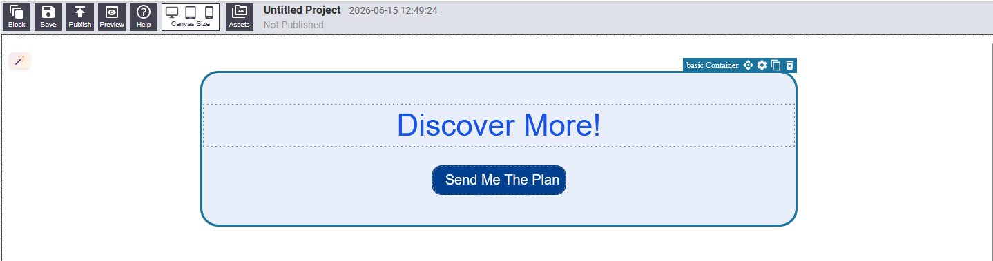
A single box that you can place inside a column or anywhere on the page. No columns — use it to create a styled content area, card, callout box, or visual grouping.
Settings
- Size — width, height, min/max width
- Alignment — content layout direction, vertical and horizontal alignment
- Background — background color with optional blur (frosted glass effect)
- Spacing — individual margins and padding on each side
- Border — style, thickness, color, corner radius per corner
- Shadow — drop shadow offset, blur, spread, and color
- Link — make the entire box a clickable link
Text Container
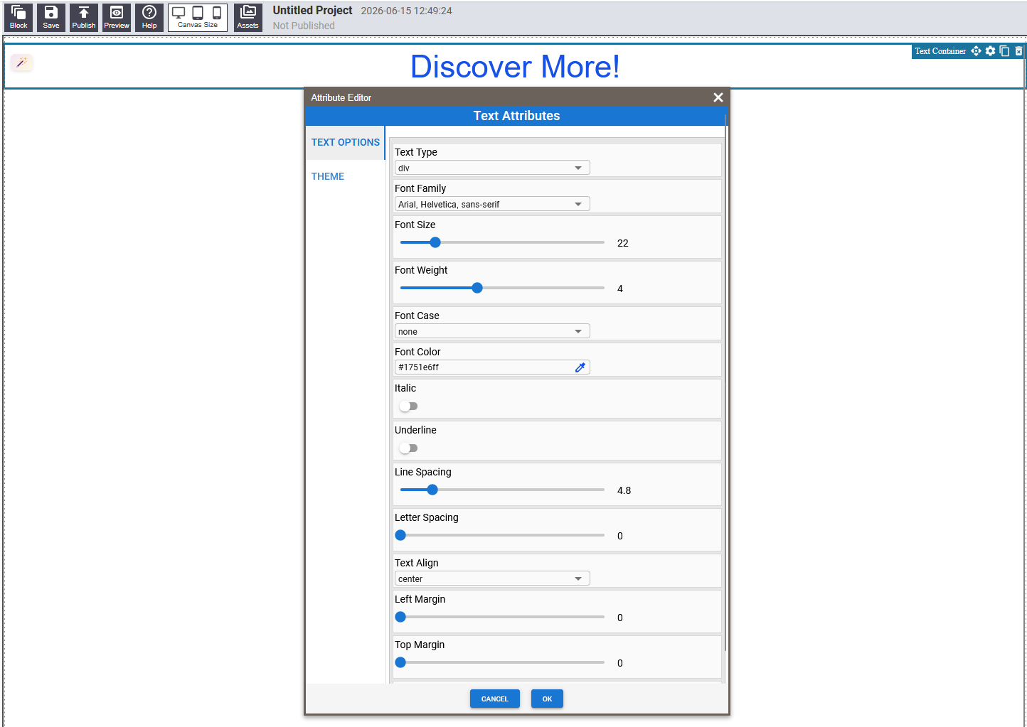
A single line or short block of text — typically a heading (H1–H6) or paragraph. Click directly on the text to edit the words. All visual styling is controlled through the settings panel.
Settings
- Type — H1 through H6 or Paragraph
- Font family, size, weight (thin to extra bold), and case
- Font color, italic, underline
- Letter spacing and line height
- Text alignment and top/bottom margins
Rich Text Editor
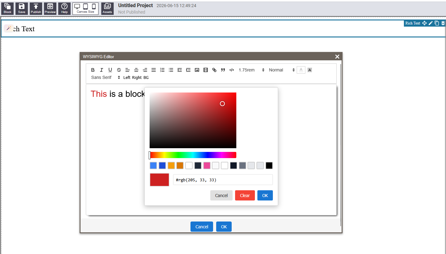
For longer passages of content that need mixed formatting within a single block. Click the block to activate the editor and a formatting toolbar appears above the text. Type directly and use the toolbar to apply formatting. Click outside when finished.
The toolbar provides: Bold, Italic, Headings (H1–H6), Bullet lists, Numbered lists, Links, Text alignment (left, center, right), and Undo/Redo.
Inline Text
The simplest text element — a short, single piece of editable text. Click on it to place your cursor and type. No formatting toolbar or full settings panel. Used inside more complex blocks for small labels, captions, or titles.
Image
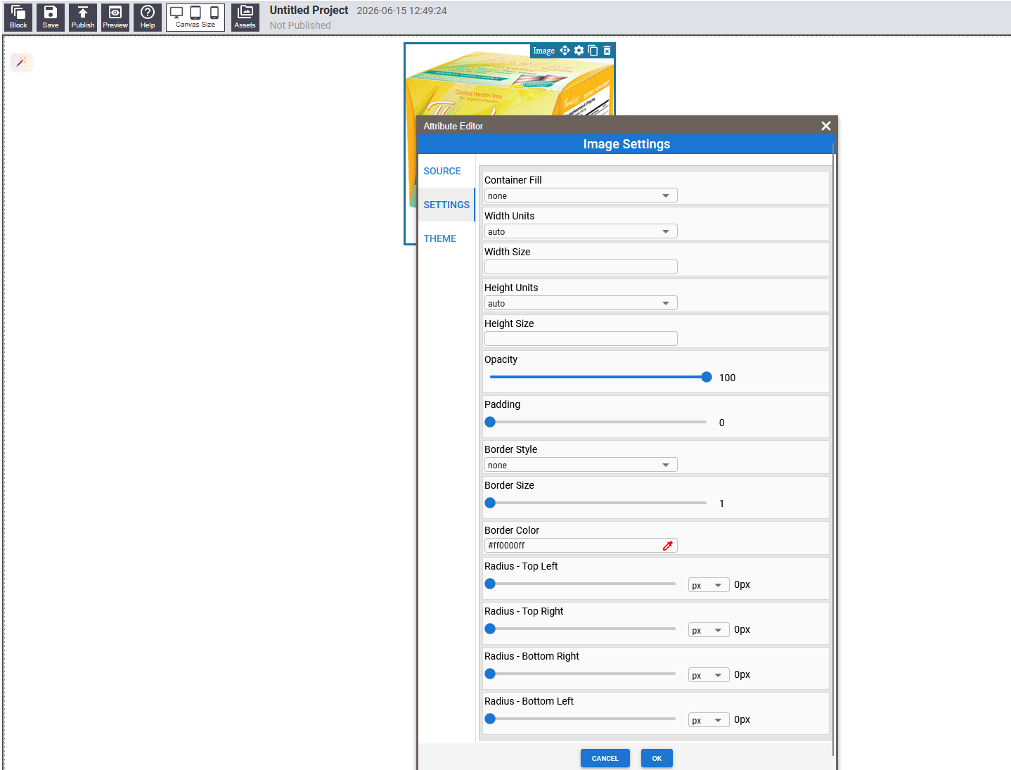
Displays a single photo or graphic.
Settings
- Image source — enter a URL or upload an image
- Width and height — set in pixels or as a percentage
- Fit — Cover (fills block, crops if needed), Contain (fits whole image), or Fill (stretches to exact size)
- Opacity — 0% to 100%
- Border — style, thickness, color, and corner radius
Icon / Button

A versatile interactive element that can display as a standalone icon, a text button, or an icon combined with a label. Always functions as a clickable link.
Settings
- Display mode — Icon only, Text only, or Icon and Text
- Orientation — icon above, below, left, or right of text
- Link — the URL or anchor this button navigates to
- Icon — choose from a large icon library, set size and color
- Label Text — font family, size, weight, color, and hover color
- Background — color and hover color
- Border — style, thickness, color, and corner radius
Form
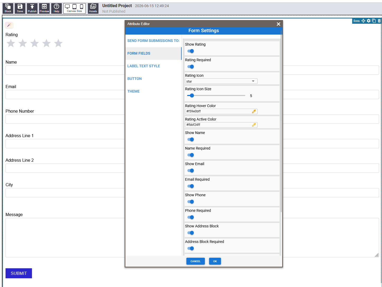
A ready-made contact form. Submissions are sent to an email address you specify. A brief countdown timer is shown when the form first loads to deter automated spam submissions.
Settings
- Recipient email — where form submissions are sent
- Fields — toggle each field on/off and mark as required or optional: Star rating, Name, Email, Phone, Address, Message
- Rating Appearance — icon style, star size, hover and active color
- Submit Button — text, font, colors, and border
- Protected Content — optional redirect URL after successful submission
Social Icons

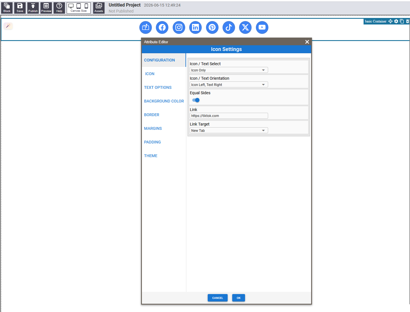
A pre-built row of circular icon buttons for major social platforms. Included: Email, Facebook, Instagram, LinkedIn, Pinterest, TikTok, X (Twitter), and YouTube.
To update a link, click on an individual icon to select it, then open its settings to change the Link field.
Hero Sections
Hero sections are large, visually prominent banner blocks designed to sit at the very top of a page. They come pre-built with a layout — you do not need to assemble them from scratch. Each hero layout offers a different arrangement of headline, supporting text, call-to-action button, and image.
All hero blocks share the same text and image areas that you can edit by clicking on them directly. The overall styling is controlled through the settings panel of the outer wrapper.
Open the block panel and browse the Heroes category to preview each layout before adding it to your page.
Hero 2
A two-column hero with headline, subheading, and call-to-action on the left, and a photo on the right. Well suited for service businesses and professional sites.
Pre-Built Sections
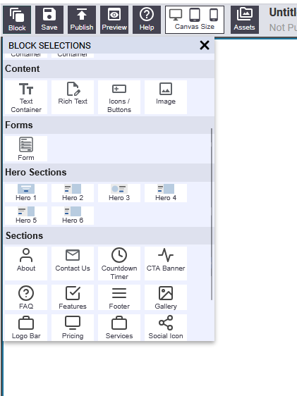
Section blocks are complete, ready-to-use page sections. Drop one onto your page and it arrives fully laid out and styled. Click on any text area to edit the words. These blocks save significant time compared to building each section from scratch.
Features
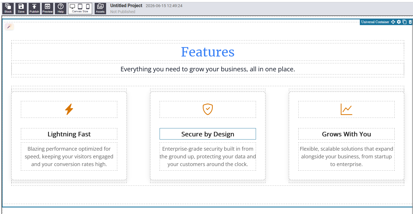
Showcases the key features, services, or benefits of your offering in a card grid layout. Each card contains an icon, a short heading, and a one- or two-sentence description.
Editing: Click any text to update it. Click individual icons to change them through the settings panel.
Testimonials
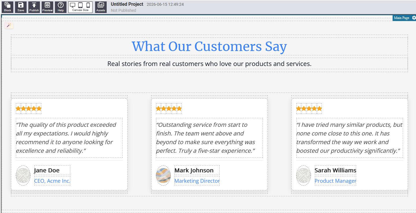
Displays customer reviews or quotes in a clean card layout. Each card contains the quote text, the reviewer's name, and optionally a title or company.
Editing: Click on each quote, name, or title text to update it.
Gallery
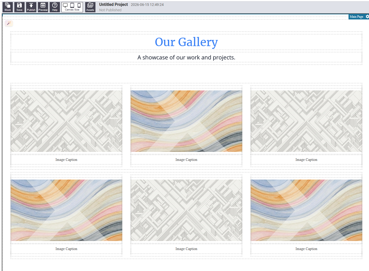
A photo grid for showcasing images of your work, products, location, or team.
Editing: Click on each image to update the image source in the settings panel.
FAQ
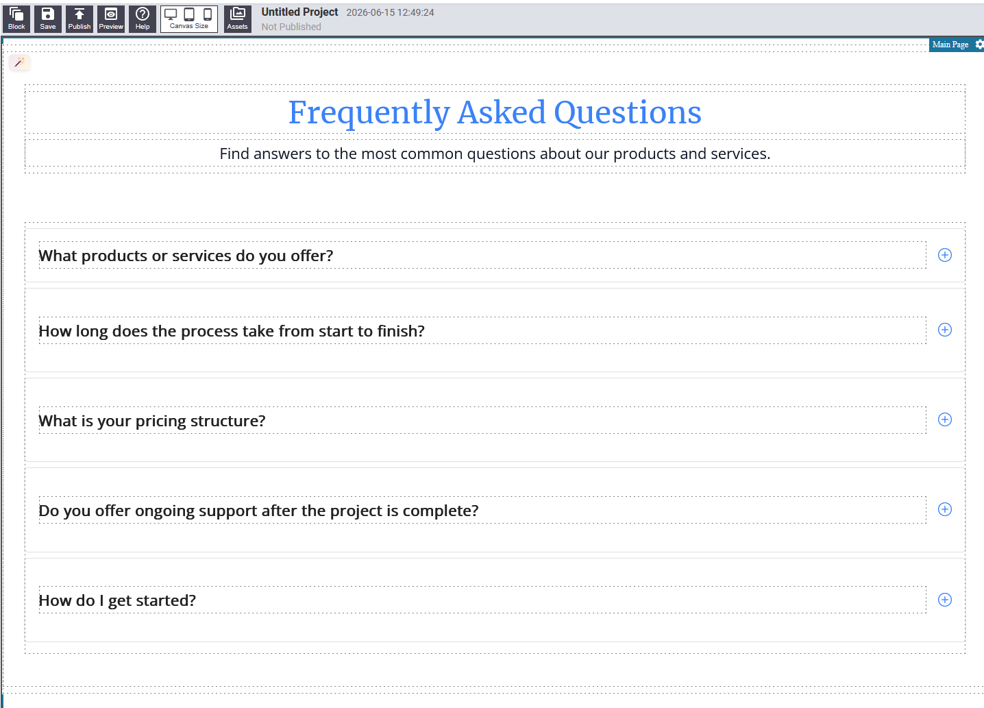
A frequently asked questions section. Each item has a question and an answer that expands when clicked.
Editing: Click on each question and answer text to edit it.
Contact Us
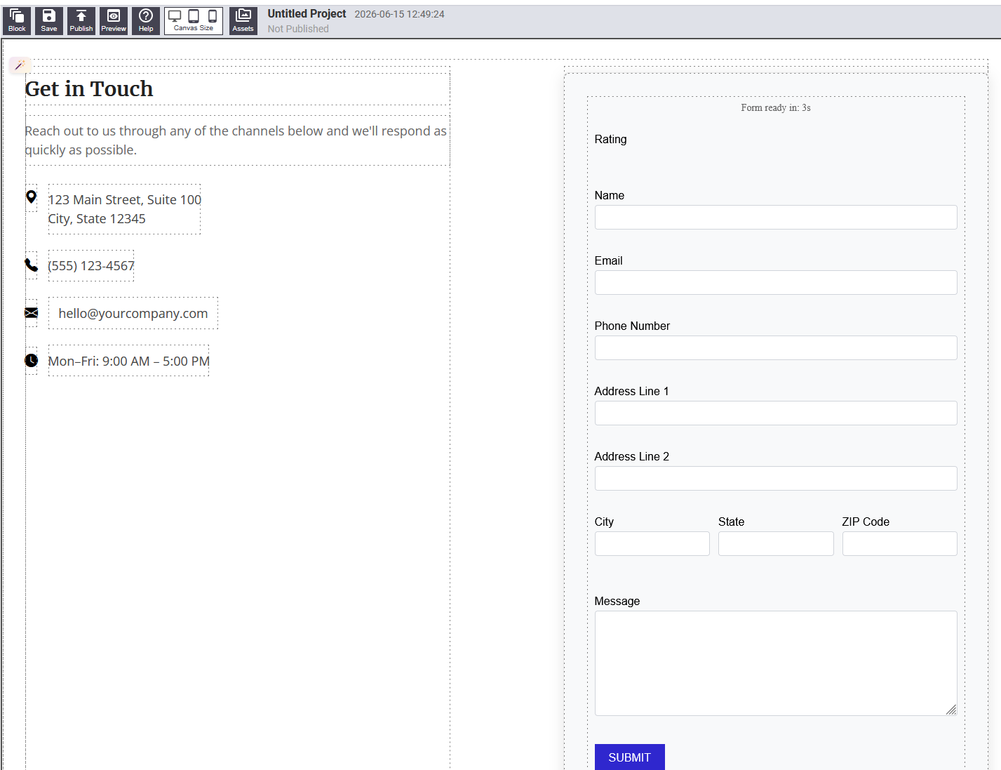
A contact information section showing your address, phone number, email, or other contact details.
Editing: Click on each piece of contact information to update it.
Pricing
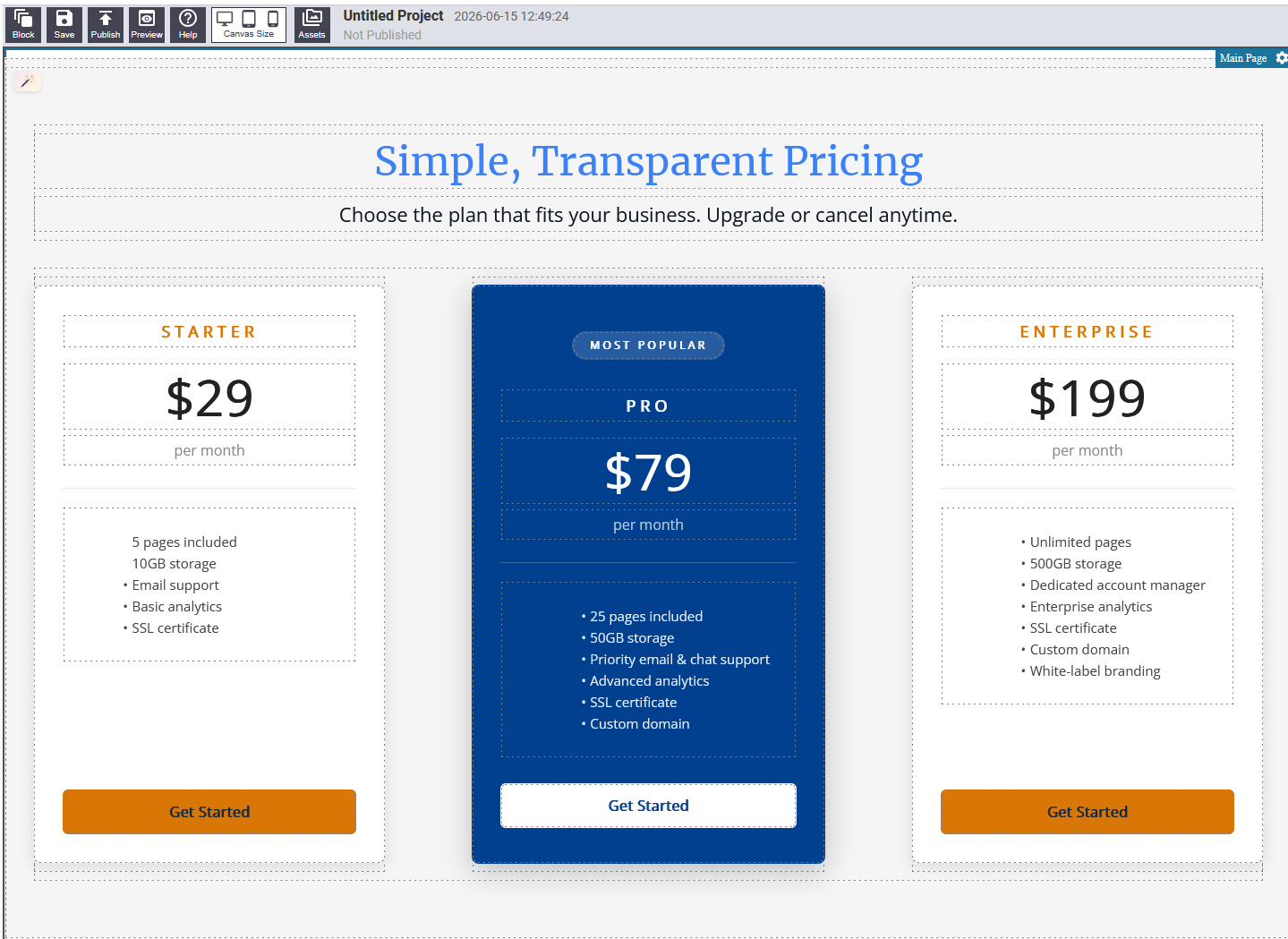
Displays your pricing plans side by side, each with a name, price, list of included features, and a call-to-action button.
Editing: Click on plan names, prices, feature list text, and button labels to update them.
Stats
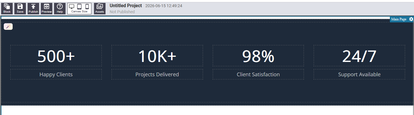
Highlights impressive numbers or achievements — client counts, years in business, projects completed. Displays as a row of large bold numbers with descriptive labels.
Editing: Click on each number and label text to update it.
Footer
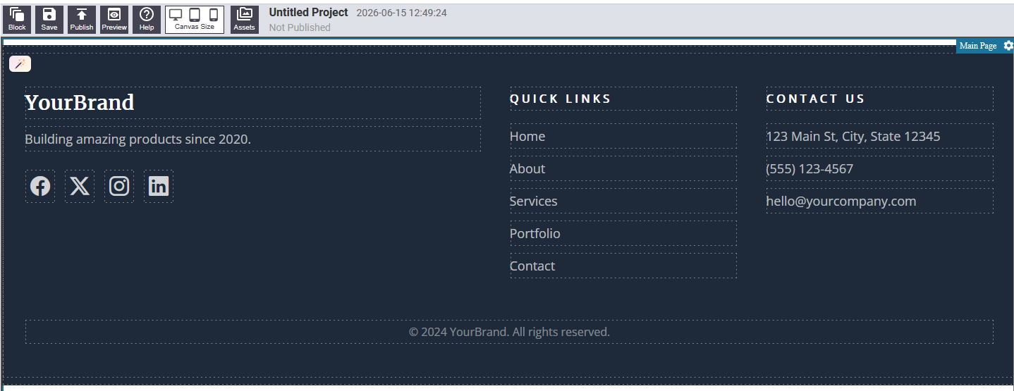
The page footer. Typically contains your business name, navigation links, copyright notice, and optionally social media icons or contact details.
Editing: Click on text areas to update them. Navigation links can be edited through the settings panel.
CTA Banner
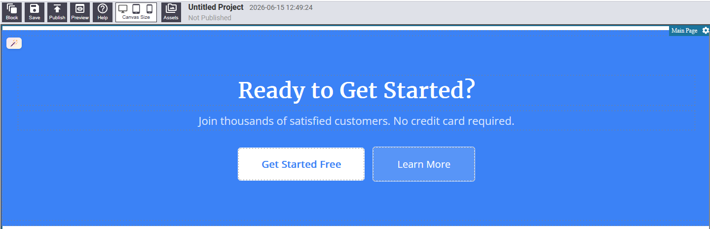
A call-to-action banner — a bold, full-width strip designed to prompt visitors to take an action such as booking a consultation, signing up, or making a purchase.
Editing: Click on the headline text and button label to update them.
Steps
Explains a process, workflow, or how-it-works sequence in numbered steps. Useful for onboarding flows, service processes, or tutorials.
Editing: Click on each step heading and description text to update it.
Logo Bar
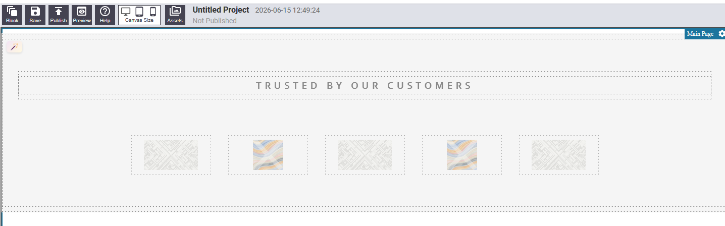
A horizontal strip displaying logos of clients, partners, press mentions, or certifications. Conveys credibility and social proof.
Editing: Click on each logo image and update the image source in the settings panel.
Newsletter
An email newsletter signup section with a headline, brief description, and an email input field with a subscribe button.
Editing: Click on the headline and description text to update them.
Team
Introduces your team members with a photo, name, and job title for each person.
Editing: Click on each name and title text to update them. Click on each photo to update the image source.
Services
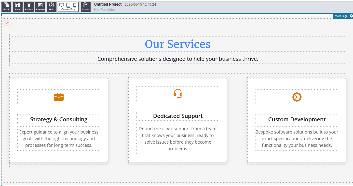
Describes the individual services your business offers, typically with an icon or image and a short description for each.
Editing: Click on service names and descriptions to update them.
Countdown
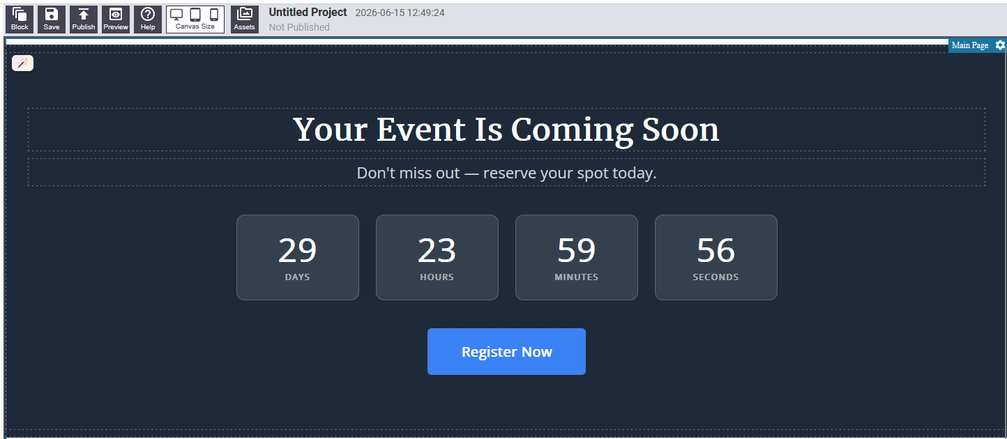
Displays a countdown to a specific date and time — useful for launches, events, sales, or deadlines. The timer counts down in real time when visitors view the page.
Editing: Open the block settings and set the target date and time.
Portfolio
Showcases selected work samples or projects in a visual grid. Each item typically has a photo, a project name, and a short description or category tag.
Editing: Click on project names and descriptions to update them. Click on images to update their sources.
About
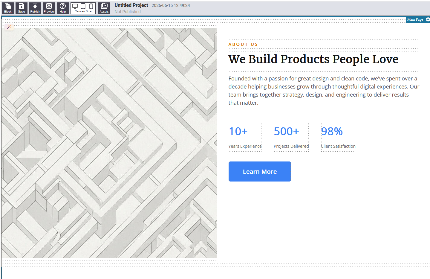
A section for telling your story or describing your business, team, or mission. Usually a two-column layout with an image and a text area.
Editing: Click on the text to update it. Click the image to update the image source.
Event
Announces an upcoming event with key details such as date, time, location, and a description.
Editing: Click on the date, time, location, and description text to update them.
Job Listing
Lists open job positions at your company. Each listing shows the job title, department, location, and a link or button to apply.
Editing: Click on job titles, departments, and location text to update them.
Builder Tips
- Start with structure, then fill in details. Decide which sections your page needs first, drop them all onto the canvas, then go back and update the content in each one.
- Use hero sections at the top. A hero block makes a strong first impression. Choose the layout that best fits your content — if you have a great photo, pick a layout that gives the image prominent space.
- Keep your page focused. A typical effective page uses five to eight sections. More than that can overwhelm visitors.
- Use the preview button regularly. The editing canvas shows helper overlays that do not appear in the final page. Click Preview often to see exactly what visitors will see.
- Save frequently. Click Save whenever you are happy with a chunk of work, not just at the end.
Save, Preview, and Publish
| Action | What It Does |
|---|---|
| Save | Saves your current edits. The page is not visible to visitors yet if it has not been published. |
| Preview | Opens a clean view of your page without editing controls, exactly as visitors see it. |
| Publish | Makes your page live so visitors can see it. |